CityScope
Costanera Concepción
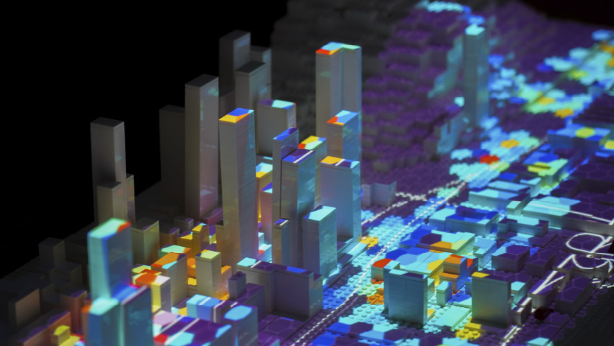
We anticipate the city’s futre using CityScope The platform, built with complex logical systems and visualization of maps and indicators, uses thousands of LEGO pieces for its physical interface, assembled precisely to represent a study area to scale. The science behind CityScope allows us to see how each project studied and analyzed previously impacts the city, allowing hundreds of different interactions between current and future situations.
CityScope
CityScope is a physical interface for integrated visualization of urban projects. It is fed by large amounts of data, which are analyzed in macro indicators relevant to the urban quality of life of a sector. The variables are projected onto the physical interface by generating specific maps that account for the changes produced on the sector, in the indicators and scenarios that are to be viewed.
CityScope works with interactive plates that group urban projects, which are sensorized by a group of receptors that indicate to the logical system what to calculate, what to project, and with what type of map to work with.
The visualization possibilities on CityScope are only limited by the availability of data for an urban project. When working with data science, access to and normalization of datasets is key to accurately anticipating the future of the city.
Anticipating out city’s future
Using City Science, we simulate the impacts involved in the execution of the urban public project portfolio planned for the Costanera sector of Concepción. In cooperation with MIT Media Lab and the global City Science Lab Network, together with the strategic alliance of the Gobierno Regional del Biobío, the Cámara Chilena de la Construcción, and Corporación Ciudades, we can analyze an endless number of variables and indicators, and thus have better urban decision-making.
Data visualization
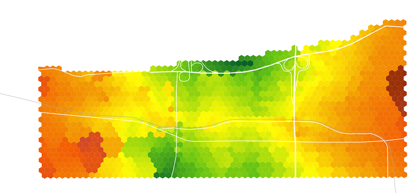
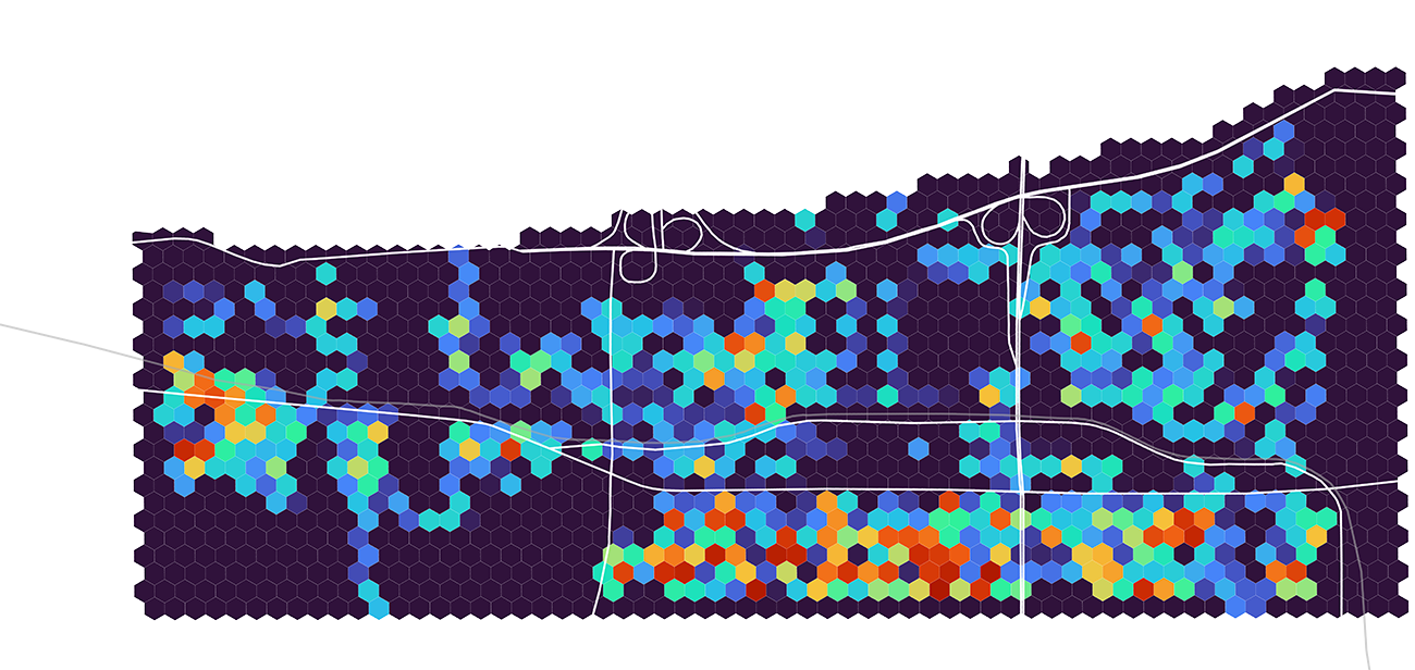
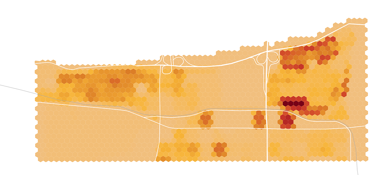
Using different types of maps to visualize data on CityScope. We emphasize the use of hexagonal grids to distribute the data to be calculated without edge biases. In diversity scenarios, we use heat maps to visualize density of activities and densities. In proximity indicators, we display the values in gradient maps, and for indicators with one-dimensional data, we use maps with unique values.